
INTRODUCTION
5th and 6th weeks' assignment was on Exploratory Prototyping. In two weeks, we needed to build an A/B test and execute it to be able to understand better the tools, technique and use areas of the test. In user experience design, both quantitative and qualitative research methods are being used. A/B test can be used for both manner, since it can be on different topics such as gaze following, scanning patterns, color, etc. it will allow us to work with data of more users than other ux based research methods.
A/B TEST
Preparation
After reading the assignment brief and making a research on A/B tests, I found out that A/B test can be conducted in any topic whenever we are not sure which way is better out of two ways. Then, I recalled one of my friend's ecommerce website, as he was telling he couldn't be sure where to put review section on his product page. I thought about it and decided that I can test both versions through an A/B test. I called him and asked permission to use his website visuals on my test and then started doing research on A/B test tools.
There are quite many remote testing tools available online. When I checked, I found out that Usability Hub and Maze had limitations on free accounts, whereas Quant UX is 100% free product. For Marvel and Optimal, I did not find their testing features as good as Quant UX. On Quant UX I can generate A/B testing wire in between frames, so it will automatically direct users one of two frames randomly. Then, in the end I will be able to see the users' screens, survey responses and other simple analytics. Accordingly, I decided to go with Quant UX. As Quant UX had integration with Figma, I first organized the pages on Figma, then imported them to Quant UX to build the test.
Topic: Location of the reviews section on the product page of an ecommerce website
Hypothesis: New users are more likely to notice and read the product reviews when they are located at the end of the page.
(new user = users who are interested in buying the specific product, but don't know its features yet)
Variable: Reviews section is placed in different locations on the product page (before the product description and after the product description)
Test Plan: As my hypothesis is focused on new users- users who are interested in buying the product but don't know about the product's features yet-, I decided to test the variables through survey at the end of the user test. Below are my survey questions:
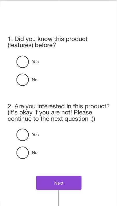
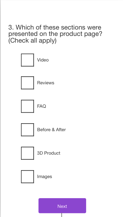
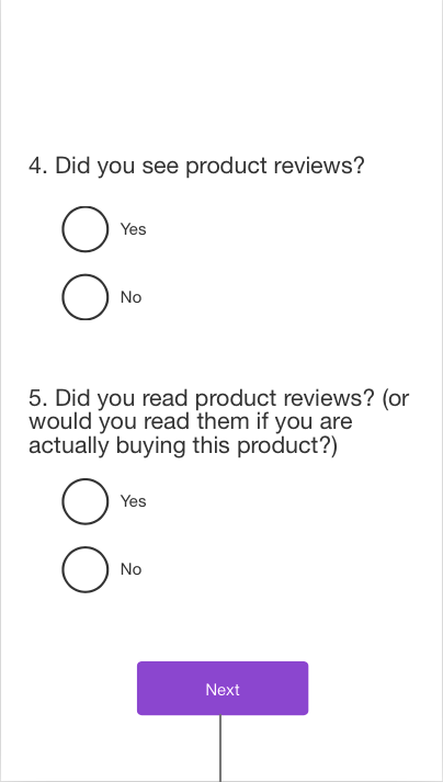
Since I was going to conduct this test with my classmates (not actual users/customers), I wanted to learn if they can be deemed as "new user". So, I decided to ask first two questions to understand if they knew the product before and if they are interested in buying it. To test my hypothesis, I will not add data from the users answering "No" to first two questions. If the users answered "Yes" to both first two questions, their responses to the 4th and 5th question will help me determine whether my hypothesis is true, or not. I added the 3rd question to cross-check the users' responses to the 4th question. Another reason I added 3rd question was to understand which sections users remember in general, and whether the reviews section's rate differs in A and B variants.
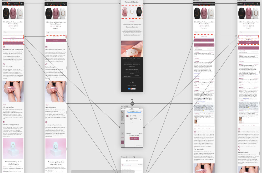
Prototype A & B: Prototype A Prototype B
Reviews section: End of the page Beginning of the page
(Before the bottom Call to Action) (After the top Buy button)


Testing
With Quant-UX it was easy to share link for tests and I could be able to receive responses immediately.
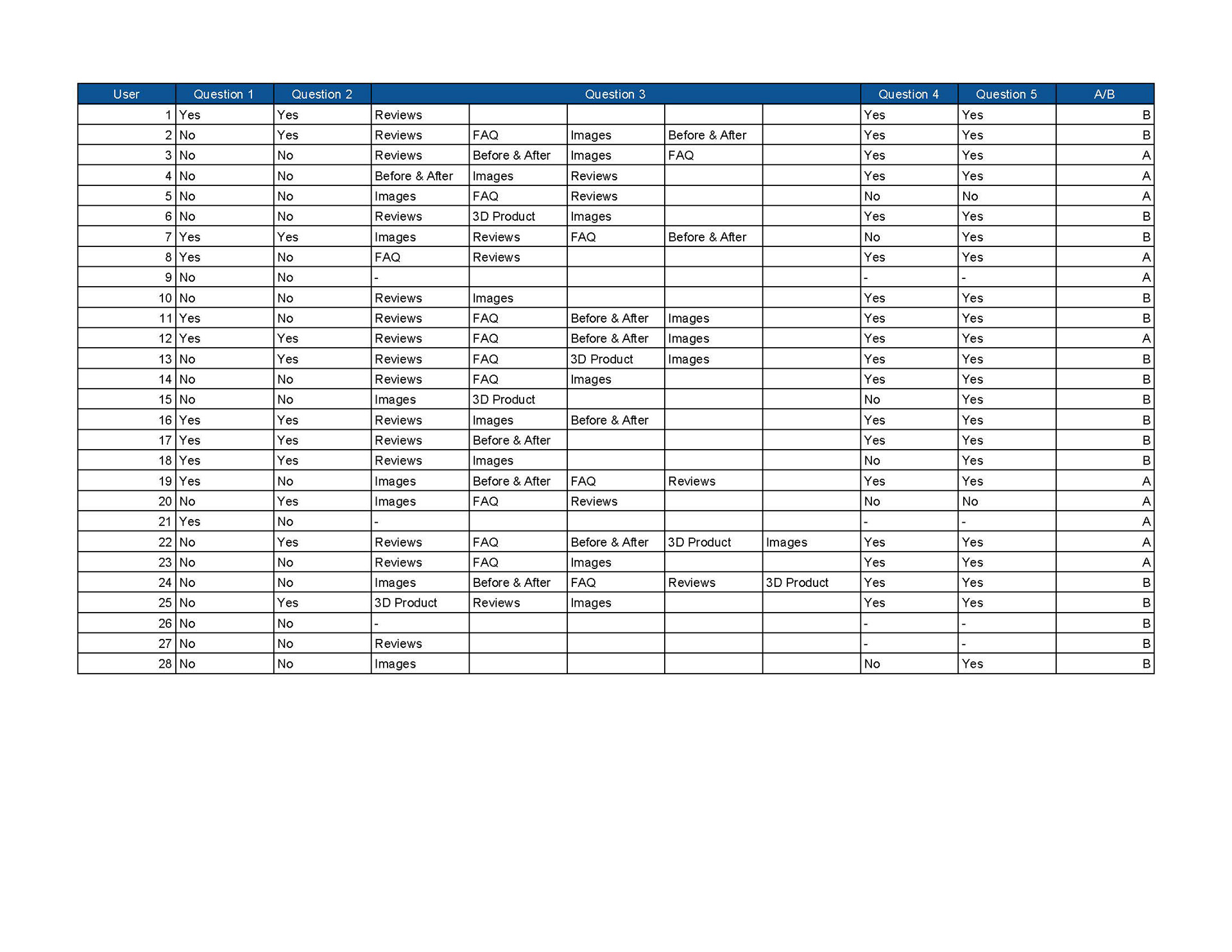
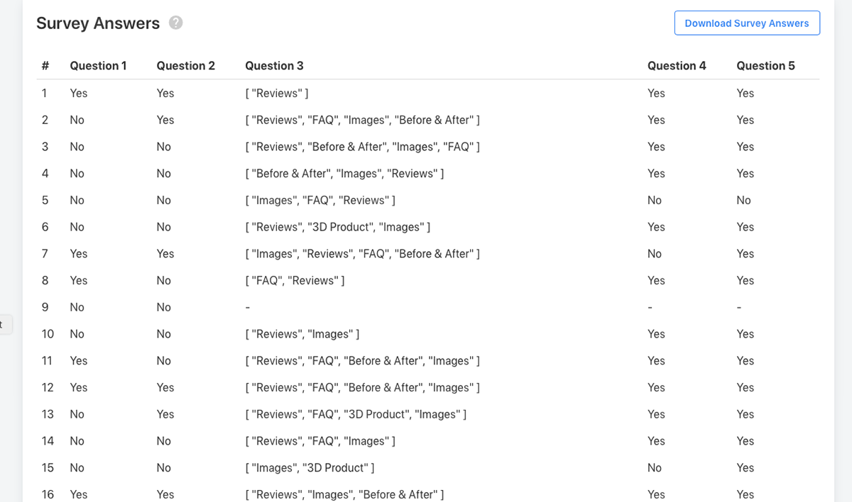
However, some tests were not completed. So, I needed to delete those tests from the dashboard manually. After I received more than 40 responses, I downloaded the tables with answers and started analyzing. First, I needed to delete failed tests manually, so I had 28 successful test to analyze. Unfortunately downloadable table was not organized, so again, I needed to organize it manually.
Analyzing
As mentioned above, I was planning to compare the results for A and B screens from the responses I received "Yes" to first 2 questions as my hypothesis consisted "New user" term. I was going to compare the New Users' answers to 4th and 5th questions. Unfortunately, I couldn't receive enough answers from the first two questions from both screens. In total 6 people answered "Yes" to first two questions. However 5 of them has seen screen B and only 1 of them has seen screen A. Accordingly, It would not be accurate quantitative analysis if I will compare 5-1 answers and conclude. As a result, I learnt that I need to make a more specific hypothesis for A/B tests not to make things complicated and to be able to analyze data accurately.
Although it is not necessary for my current analysis of the hypothesis, I have done a cross-check with the Question 3 and Question 4. Here, I see that 5 of the users answered they have not seen the review section, however on the 3rd question, they checked reviews section. Accordingly, I would be suspicious with the survey answers. This confusion might be because of the formulation of the Question 3 and 4. On Question 3, I asked something related with the memory. On the other hand on Question 4 I asked if they had seen the product reviews. So, they might have thought seeing the reviews actively.
Although it is not answer to my hypothesis, I made below analysis from the responses I gathered in general:
If I don't take first 2 questions, and New User criteria into consideration, from Question 4, I can conclude that having review section on the top or bottom did not make much difference as "Yes" rates are 73% and 77% for A and B screens respectively. In general, users have seen the review section.
12% of the participants mentioned that they had not seen the review section , but on the other hand they answered the 5th Question as "Yes". Since they cannot read the reviews if they hadn't seen them, this discrepancy is caused by the formulation of the 5th question. Because of the explanation of the 5th question, this question is not testing only one variable. Accordingly I can conclude that, this question is not suitable to this test.
From the participants who don't know the product's features, they have seen review section 75% on B Screen (when it is on top of the screen) and 66% on A screen (when it is on the bottom of the screen). Accordingly, I can conclude that if this group is targeted by the company, positioning the review section on the top might increase the notice rate of the reviews.
On the other hand, the participants who knew the product before, have noticed the review section by 66% when it is on the top and by 100% when it is on the bottom.
Last point I would like to make is about the participants who are interested in buying the product. They have read the reviews by 100% when review section is on the top of the screen, however by 66% when they are on the bottom.
REFLECTION ON TESTING & RESULTS
Testing:
I noticed that since I put screenshots from an actual website but did not make all buttons working, participants got confused as they tried to click on other buttons, as well. Accordingly, next time I will make sure to have a more functions working on the website or application I am conducting an A/B test.
As it can be seen above, I couldn't test my hypothesis with not real users. There were two constraints: first, I tested with my classmates, and apparently most of them are not a real user (it can be seen from their answers to first 2 questions). And secondly, I had only 28 participants which also made my job harder as the conclusion might be misleading with less participants.
Quant-UX:
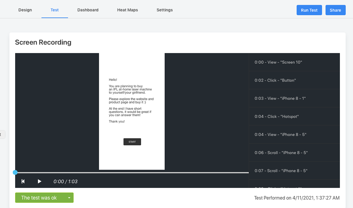
Screen recordings from the tests were very good, I used them a lot, since the tool did not show which screen has shown on dashboard (next to survey answers). So I needed to check all of them manually. I am not sure how would I do if I had more participants. (I put dashboard and video recordings screen below for reference).
Other than this, I needed to delete failed tests and in the end on tests page it showed me 29 tests, however on dashboard 28 tests. As survey answers were on dashboard, I took that into consideration and entered the data on an excel spreadsheet manually with screen data. (Spreadsheet image is above)
As I came across these problems, I am not sure if I will use Quant-UX for my next A/B test. I think I will make a broader research on testing tools if I need to conduct another A/B test.
REFLECTION ON A/B TESTING
With this assignment I understood better how to conduct a quantitative test and why having a good hypothesis is important. I tried to be specific with my hypothesis, however it ended up not having enough responses to fulfill my hypothesis. Accordingly, for the next tests, I will formulate more specific and clear hypothesis to be able to interpret the data correctly. I feel like A/B testing in UX has a very special aspect. Since in general we conduct tests (interviews, usability tests, etc.) with 5-6 people, I feel like we tend to forget the importance of data. With quantitative tests, we are able to see and understand the general tendencies on our product and easily test which way is working better. To be able to test this, we need to make sure how we will measure our hypothesis, and also testing one variable at a time. Otherwise the data we gathered would be meaningless excel lines.