
INTRODUCTION
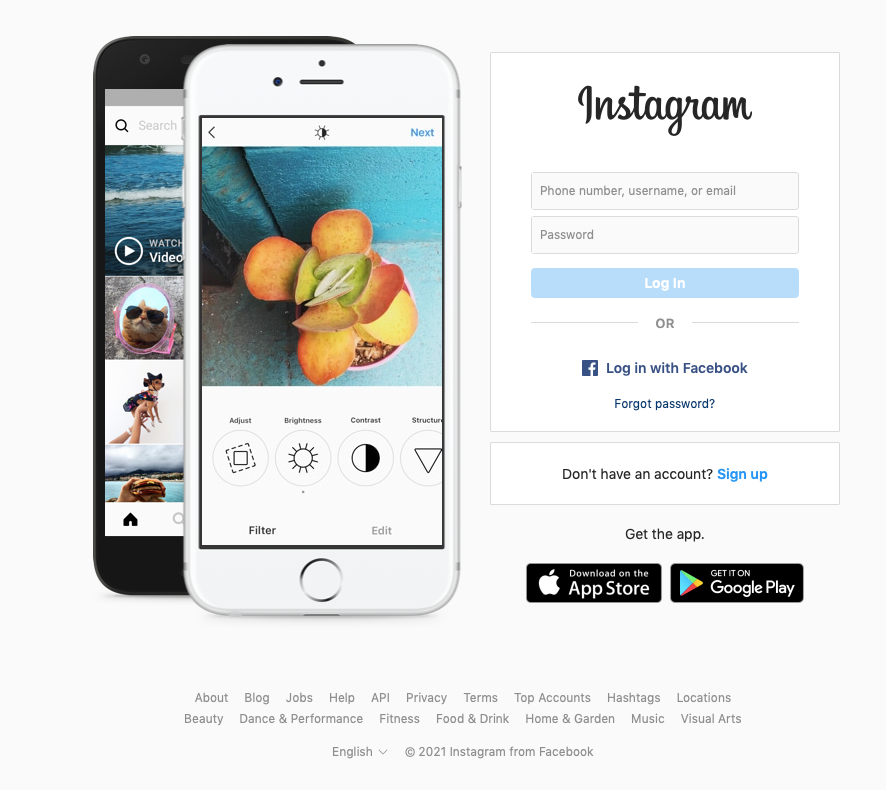
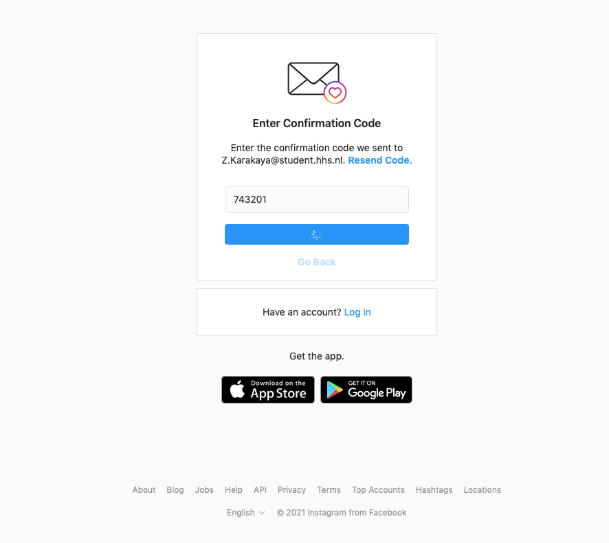
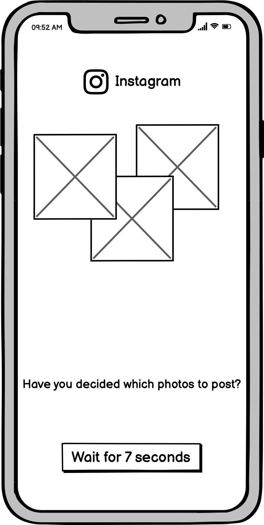
This week, we are starting to prototype for screens. Before going deep to the hi-fi prototypes, we will first build wireframes, which is the step after sketches and paper prototypes. It requires more time and effort than those, but less than hi-fi prototypes and mvps(most-viable-products). For this week's assignment, we need to choose a signup process of an existing application or website and build wireframes for it to be more engaging and exciting. Requirements are welcome screen, collection of personal information, and at least 10 seconds waiting screen. I chose Instagram's signup process for this assignment. Below is the current process of Instagram.
PROTOTYPING
Before starting to build wireframes, first I needed to decide which tool I was going to use. There were options like Balsamiq, InVision, Proto.io, Figma, Sketch UXPin, Justinmind, Axure, and so on. I eliminated Figma as I previously used it and I wanted to try a new tool. Then I eliminated Sketch as I did not have free access to it. Since we needed to run a quick research on tools and then decide which one to use, I opened the websites of all. The most straight forward and easy to use tool was Balsamiq among all. With the previously made elements and screens, Balsamiq made the wireframing even faster than paper prototyping because we don't need to draw anything on screen. The only thing we need to do is to adjust the size and position the elements in line with our sketches and ideas.
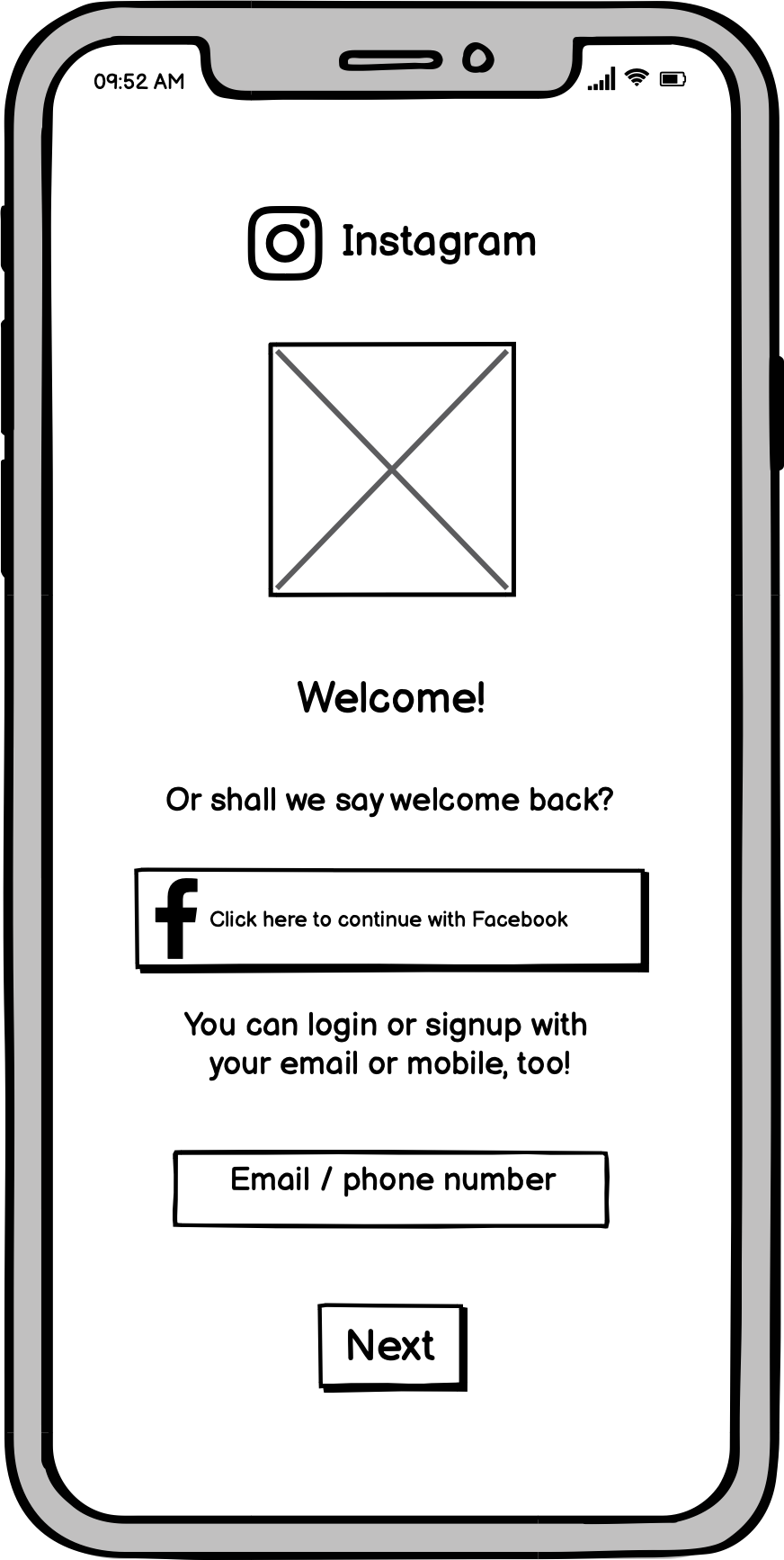
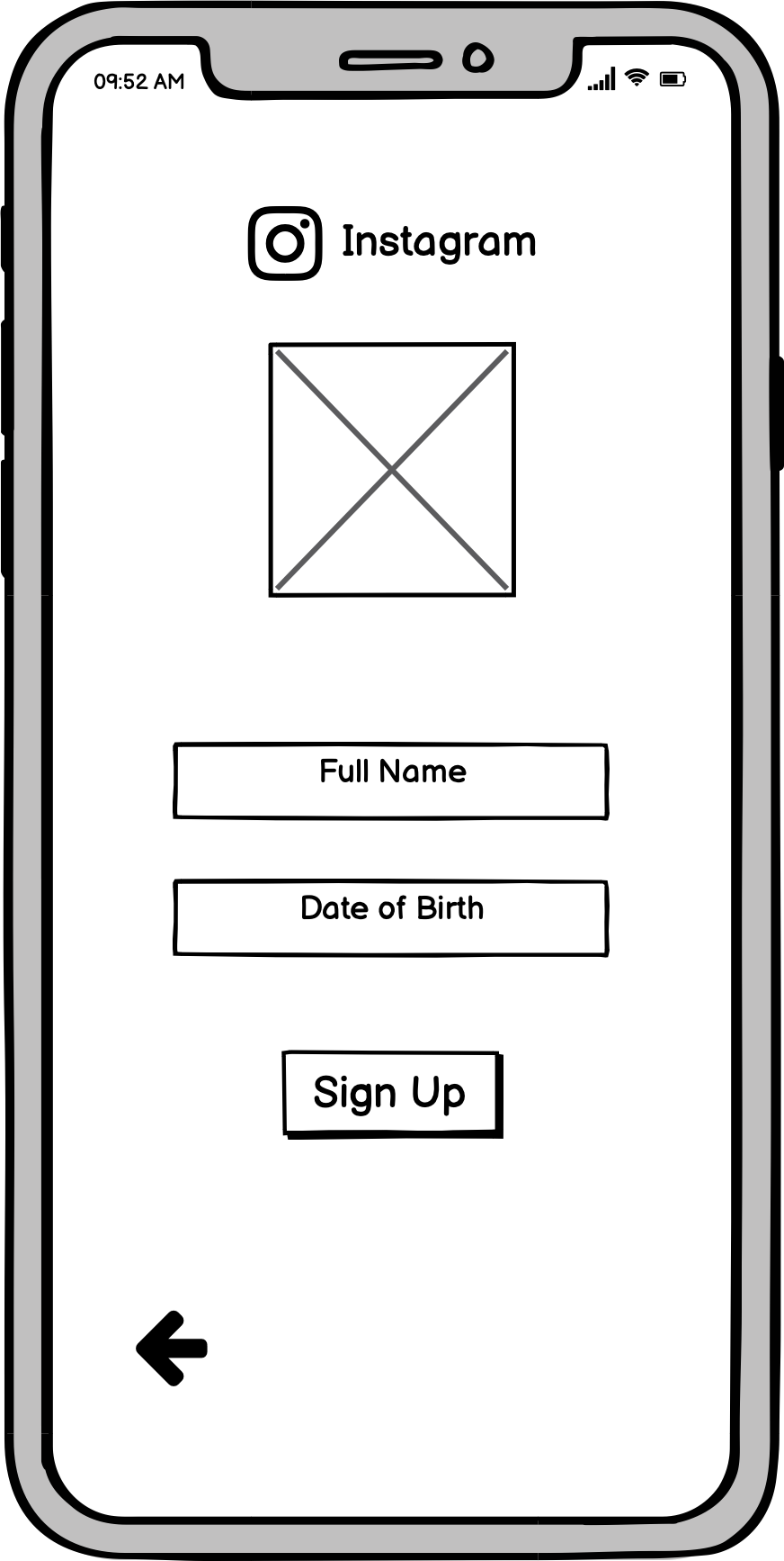
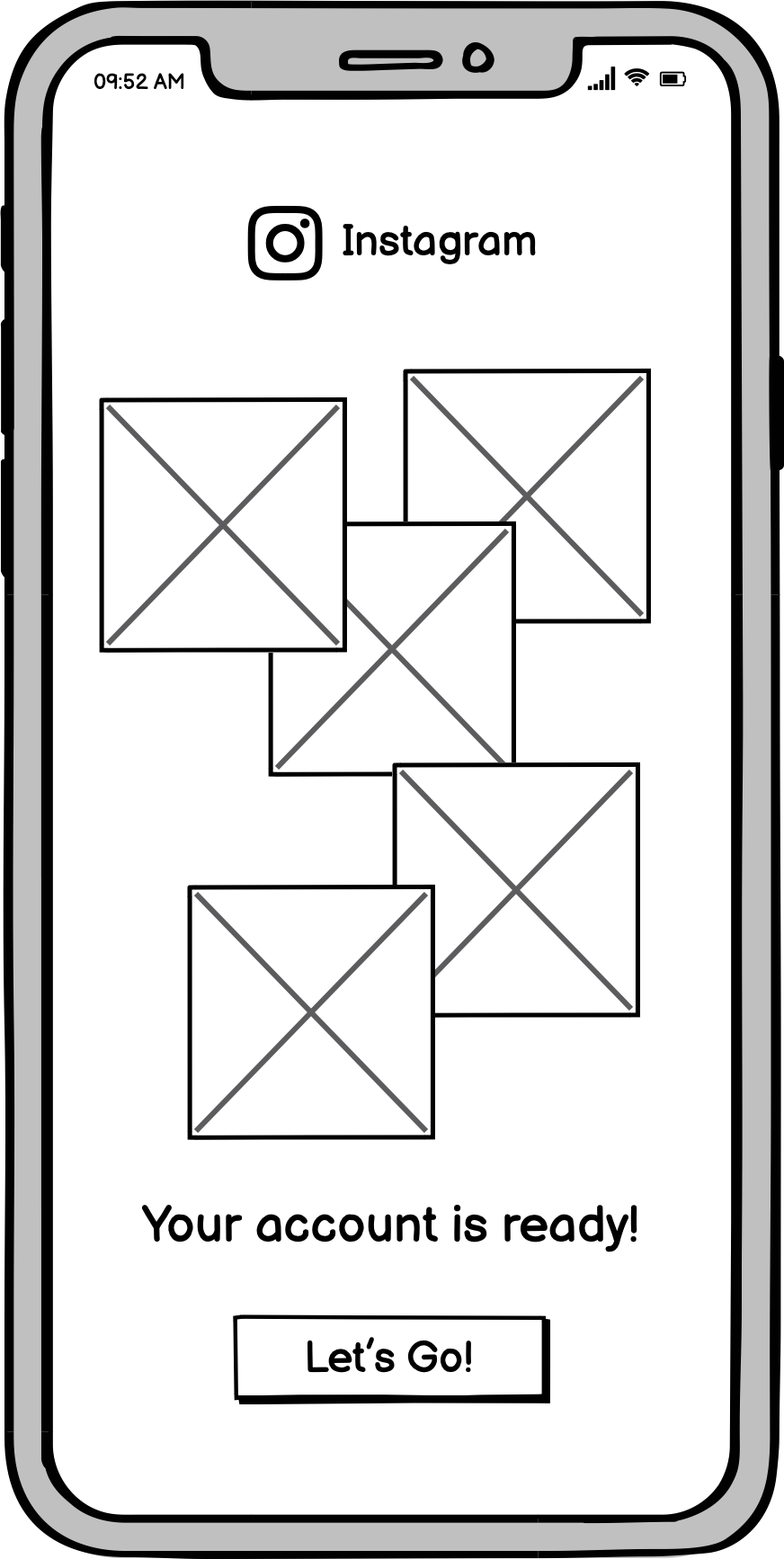
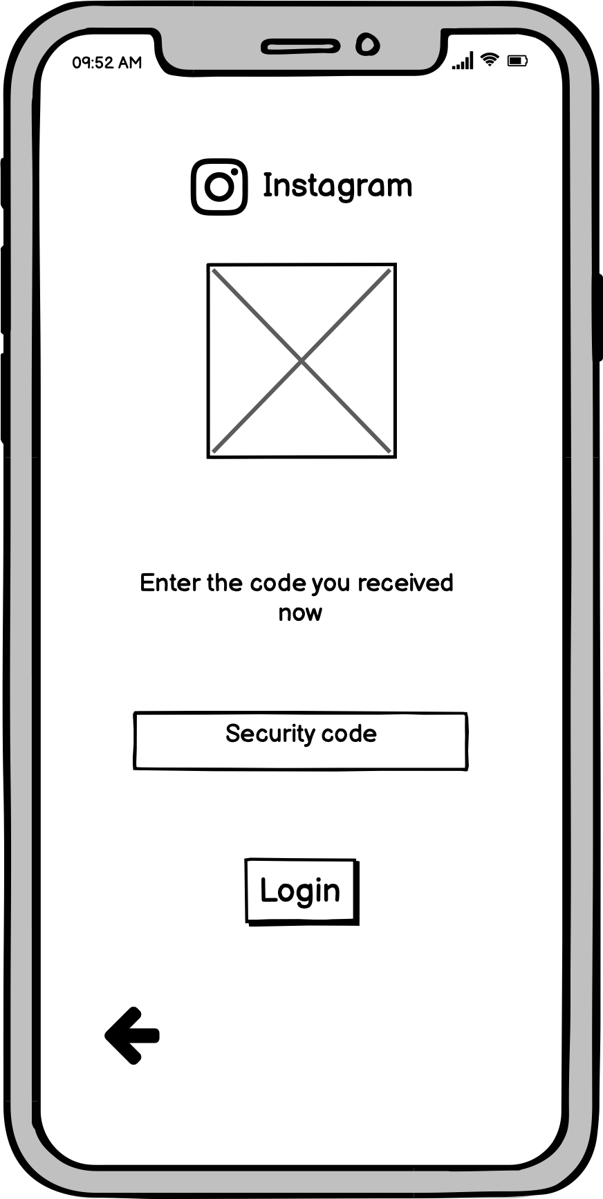
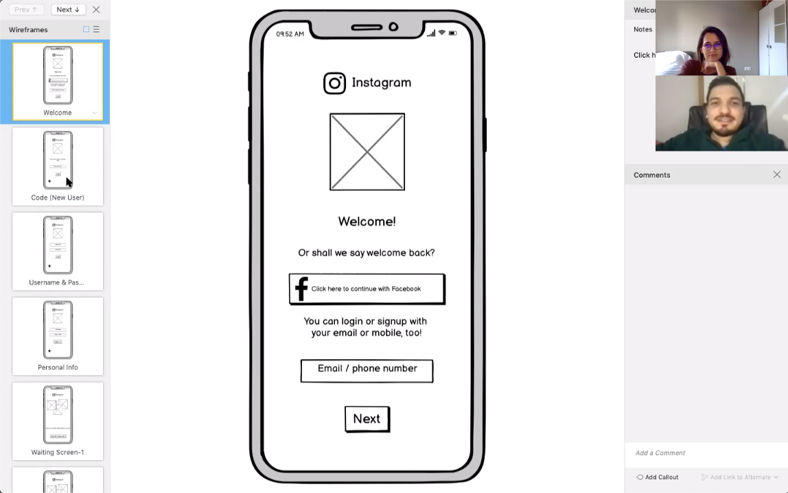
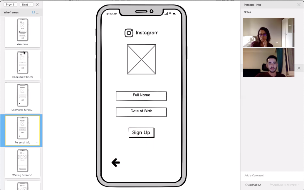
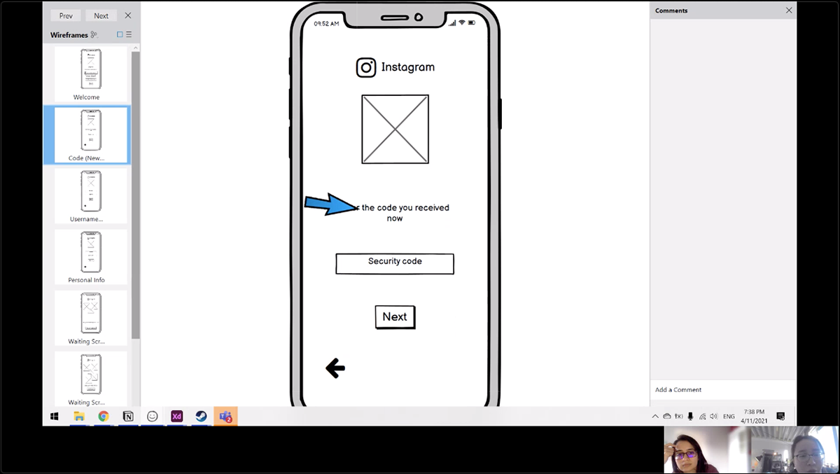
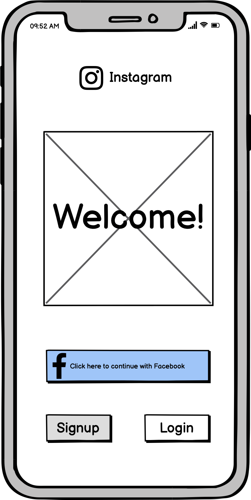
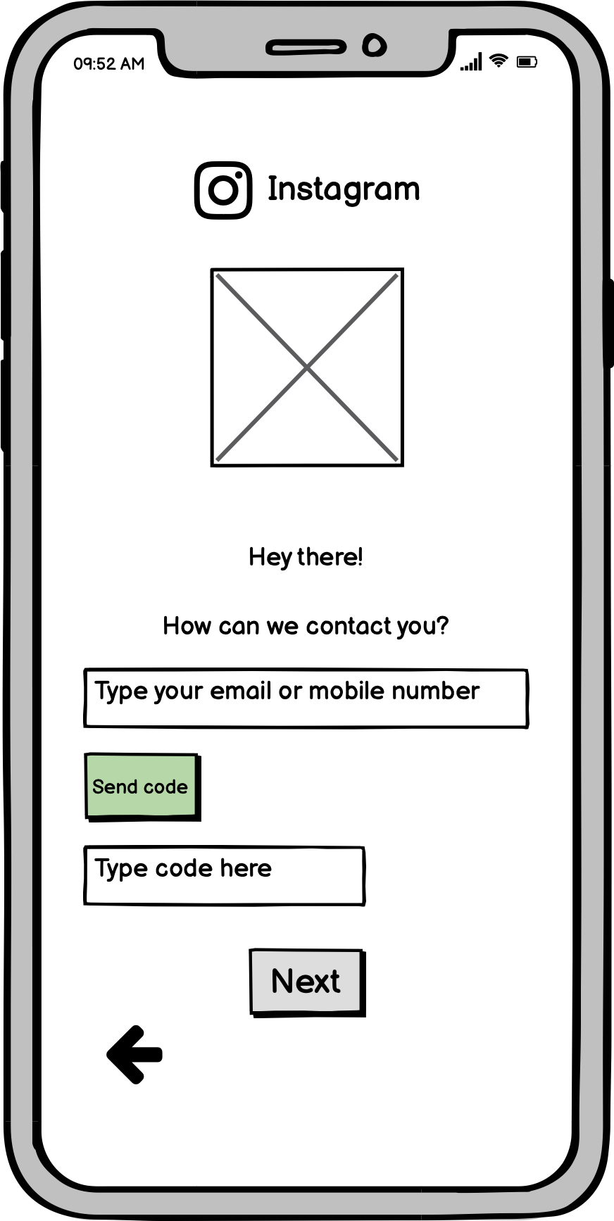
On my signup experience, I decided to eliminate Signup and Login buttons from the Welcome screen. Accordingly, I only ask the users to type their phone numbers or email addresses. When they enter it and click next, both new users and existing users will be asked to type security code sent to their emails or phones. After entering the code, if the users are existing users, the system will direct them to their account. On the other hand if their credentials are not found in the system, this means they are new users, so the system will direct them to the signup page. In order not to complicate things, I decided to divide personal information screen into 2 followed by a waiting screen before landing to the profile.
The reason I decided to go up with this flow is I found out that Instagram's welcome page is basically a login page and there is a very small line of sentence for new users to signup. However, in my approach users won't need to think where is the signup page or where is the login page. They only need to enter their contact credential. Then verify their account with security code. In this case, they even don't need to use their passwords when logging in but it can be used for errors or security purposes within the system. Moreover, having contact number or mail address verified in first step of the signup is better for users. Because, this way they won't need to exit Instagram when they complete their signup process. Doing this check in the beginning will allow Instagram to let users directly start using the application when they click Sign Up.
Below are my version 1 prototypes as I described above:
Signup Process

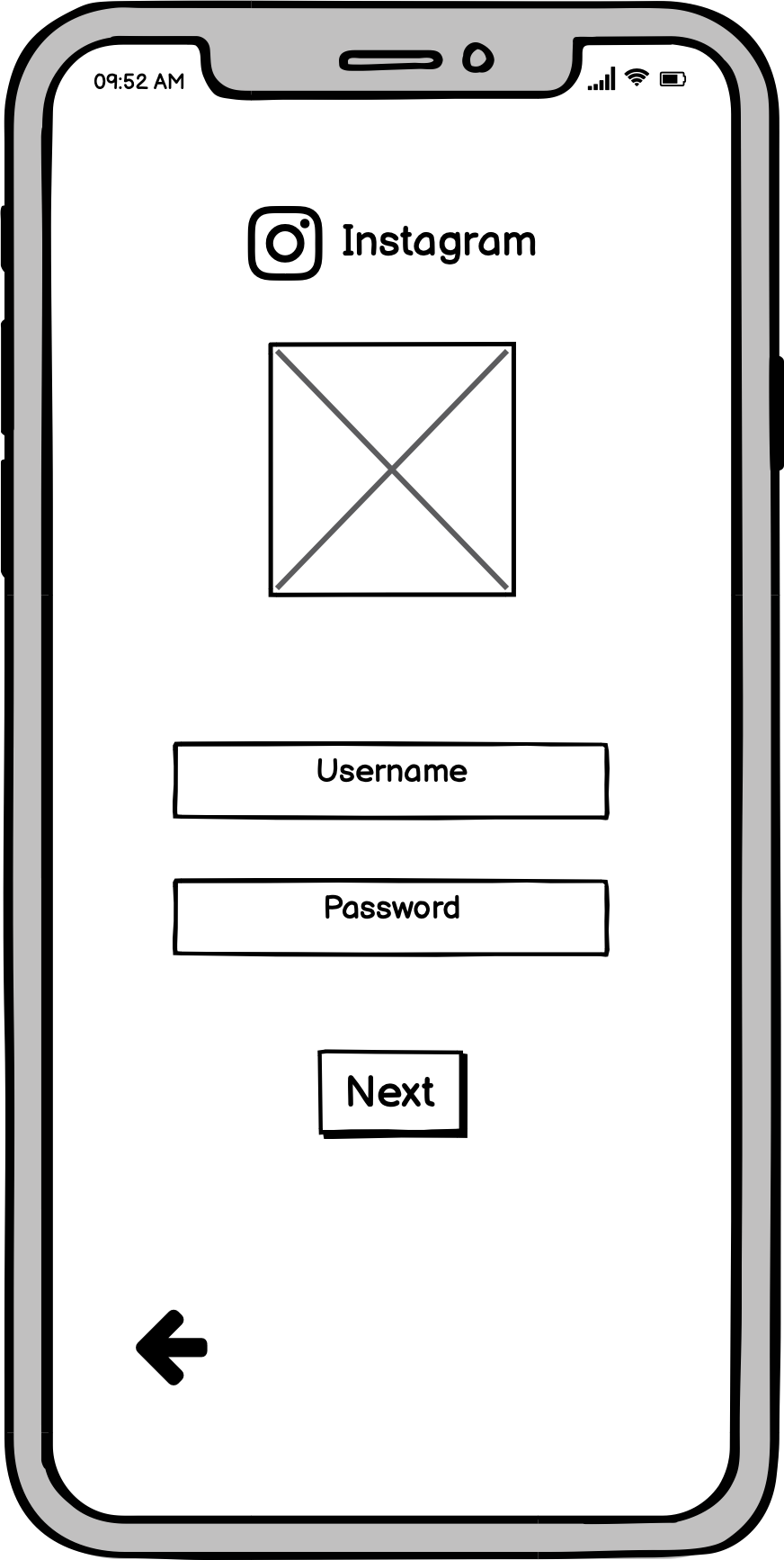
Login Process


TESTING WIREFRAMES
I conducted 3 usability test with my wireframes. Since I used Balsamiq as a tool, during the test I couldn't share a test url with the user (I needed to share the Balsamiq file and I did not want to frustrate my users). Accordingly, I shared my screen and opened the preview mode on Balsamiq file. Informed the users that I will only click on where they tell me. So I was a passive test leader and I watched their interactions with my wireframes during the test. After the test I asked them about their opinions on the process. The things they liked and the things they would change.
The tests went smooth, there was no confusion on the users' side in any of the actions. Accordingly, I only could have feedback regarding the process with post test questions. Below is the synthesis of the feedback I gathered and my reflection on it when making decisions for the second version.
Security Code
Users commented on first security code scene. One of them mentioned that "If I am an existing user, I wouldn't like to do the security code verification each time I login." Another user would like to see there will be a security code field on the same page of the email/phone input, so she would be get ready for it. As a last point users mentioned that there is no button for resending the code.
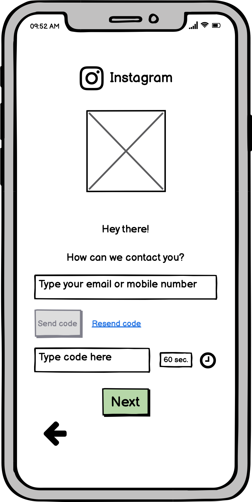
My reflection: I found both feedbacks regarding the security code as valid. Accordingly, I decided to get rid of security check with existing users, so they will be able to login by their emails/numbers and passwords directly. For the second comment, I also decided to put email/phone input field on the same page with a send code button and code input field on my second version. I added resend code button as well.
Process Order
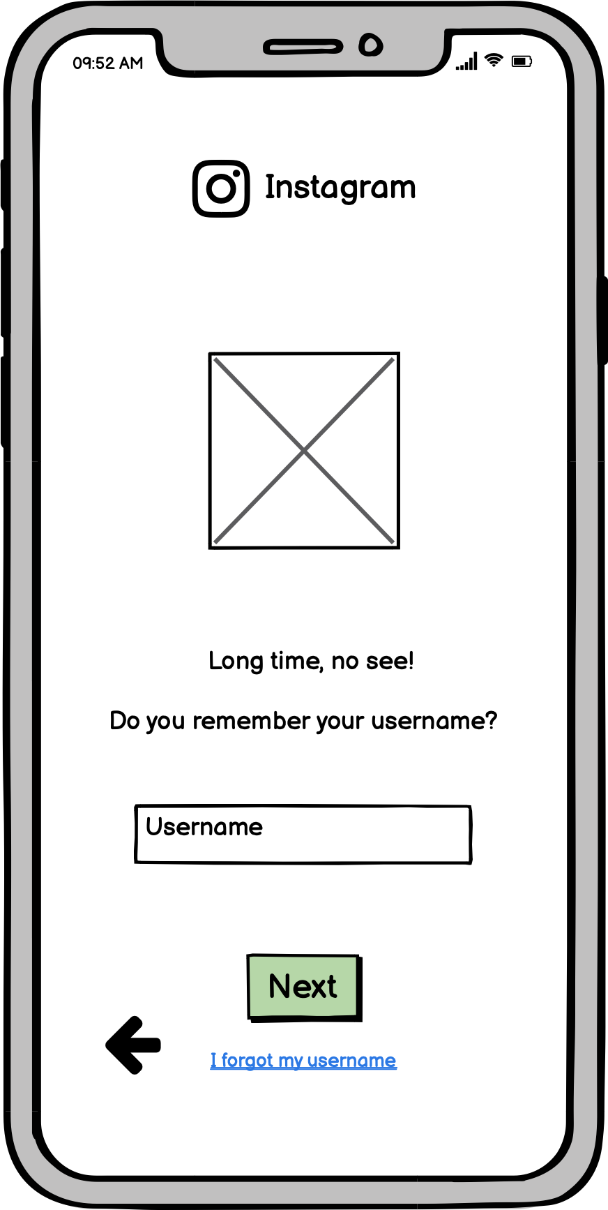
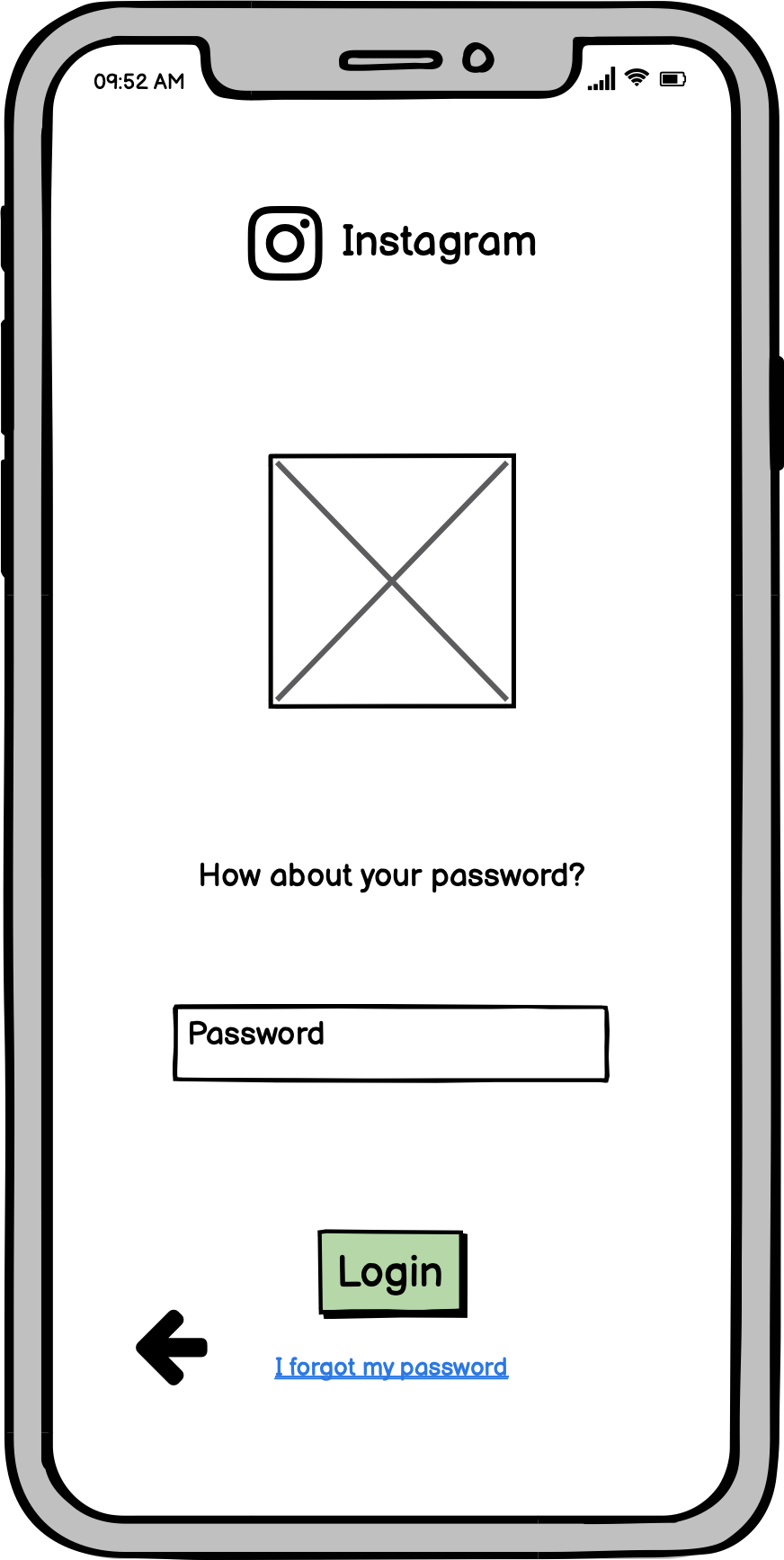
Although it was not about signup process, one of the users mentioned that he would like to login through typing email/phone number and password on different pages. Because with this, user can understand which information is wrong (if the email is wrong he wouldn't be able to proceed to the password page or if the password is wrong he wouldn't be able to proceed to login). With this login experience, user can request an email by clicking on forgot my email or forgot my password buttons on different pages. Another user commented on he might forget with which information he signed up and might try with different emails each time to login.
My reflection: I really liked to point the user made and I realized that I forgot to put "I forgot ..." button on login page. So I decided to have 2 pages login process with 2 "I forgot..." options. I also changed email/phone number field in login to "Username" field in line with the last comment I received.
Call to Actions
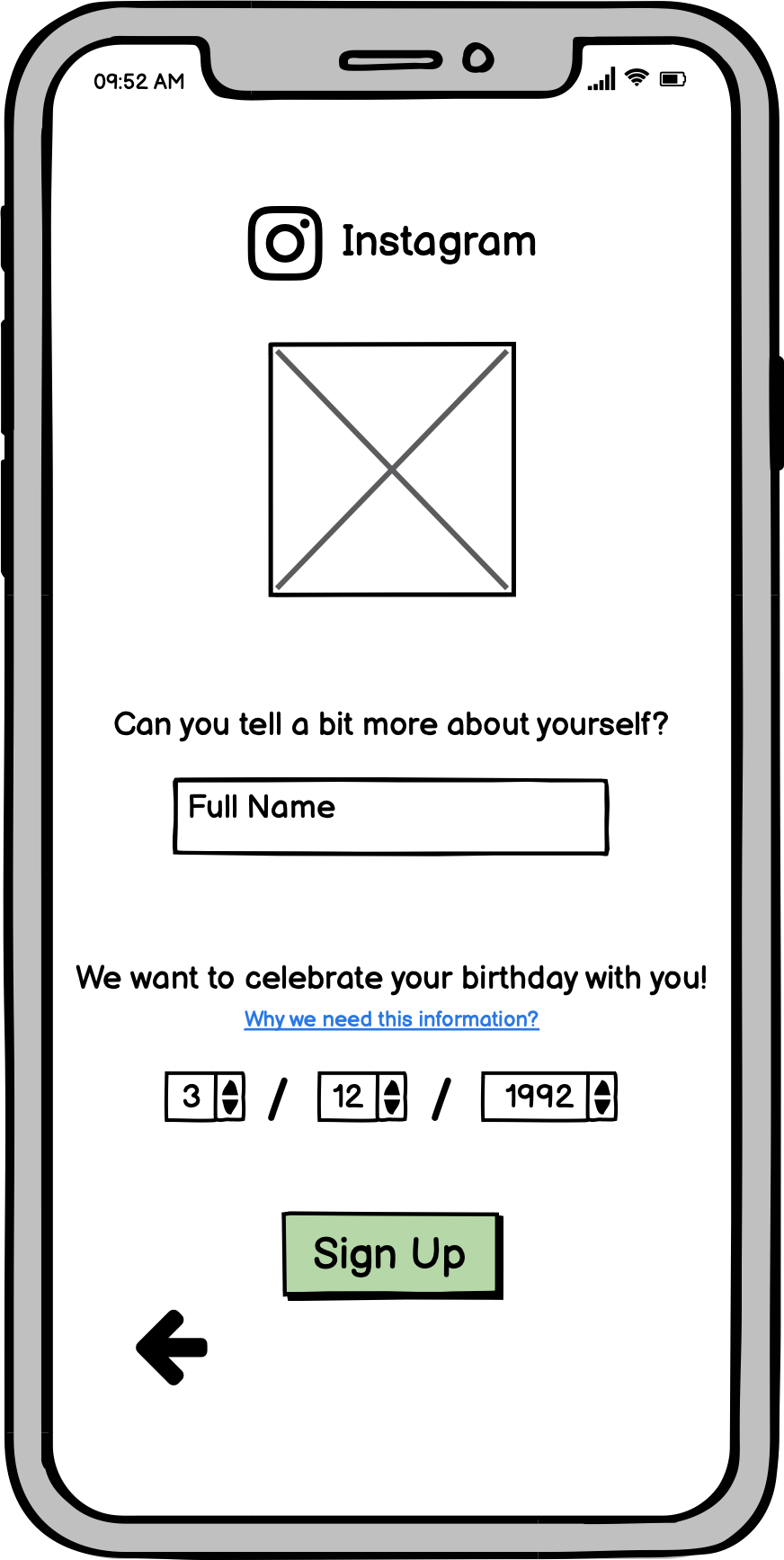
One of the users confused with the signup process as there was no information / call to action line like "can you enter a username?" etc. Another user suggested to get rid of the button on animation page (making it automatic animation).
My reflection: I added fun and friendly description lines for each page of login and signup processes. For the button, I decided not to comply with this suggestion as I prefer users to decide when to proceed for their account. Which might increase the engagement and interaction level of the users from the first second.
Security
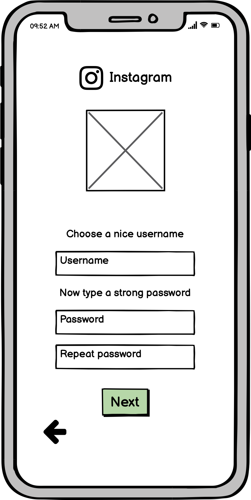
Users mentioned that they would like to have "Repeat password" field to eliminate possible mistakes.
My reflection: At first by having one password field, I was planning to do "hide-show password" tick box in my hi-fi prototype. However, since I got 3/3 feedback on having 2 password fields, I decided to change the order and have second password field as users are more comfortable with this and this does not give them any frustration.
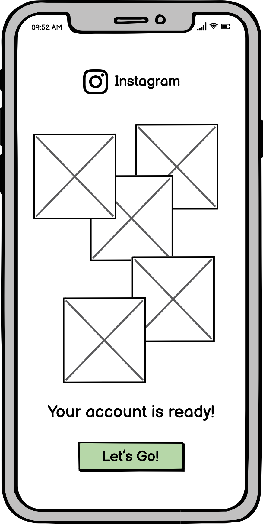
Below are my version 2 prototypes in line with the changes I described above:
Signup Process


Login Process


REFLECTION ON WIREFRAMING AND USABILITY TESTING
In general, I enjoyed from the process with wireframing and usability testing. I understand why it comes after paper prototyping. However, I felt like with Balsamiq, building the wireframes were even easier and faster than paper prototyping. Accordingly, if it is not required from the client, I would do some sketches and plan the flow on paper then start with lo-fi digital prototyping without detailed paper prototypes in the future. The usability tests help me to understand what users think and do when interacting with a product. Moreover, I realized I forgot to add some options or buttons during the test e.g. forgot my password or resend the code buttons. So, I understand why it is important to do the tests with wireframes before proceeding to hi-fi prototypes which require more time and effort.