
INTRODUCTION
As wireframing and usability testing for our selected interfaces are done, this week's assignment is on converting those wireframes into high fidelity prototypes. Which means the interface needs to give the feeling of a real application when testing with users both with functionality and visual aspects. As we are following the same flow, we will take the second version of our wireframes and work on them to make more realistic visually, add micro-interactions, as well as waiting screen animation. The prototype needs to be engaging, fun to use, detailed and have a coherent design.
PROTOTYPING
As mentioned above, for hi-fi prototyping, we need to make our prototypes into live. Here, again we are presented with different tools to work with, such as Axure, JustInMind, ProtoPie, InVision, Origami Studio, and so on. We needed to check the tools and decide which tool we were going to use. When I checked them, I found out that ProtoPie has very nice features for micro-animations and has educational offer, free for students. Accordingly, I decided to proceed with that.
Signup Process

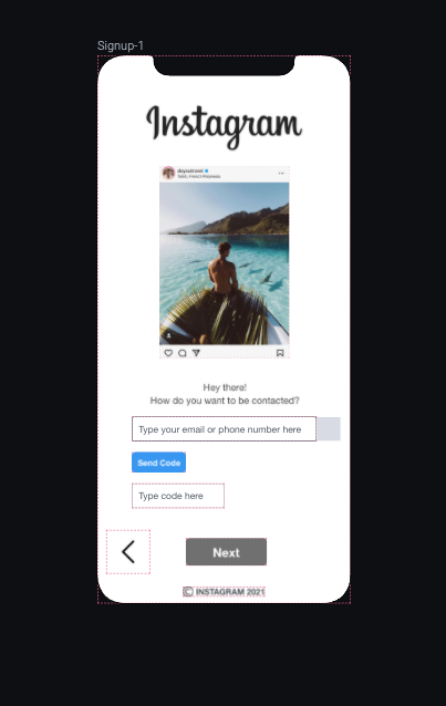
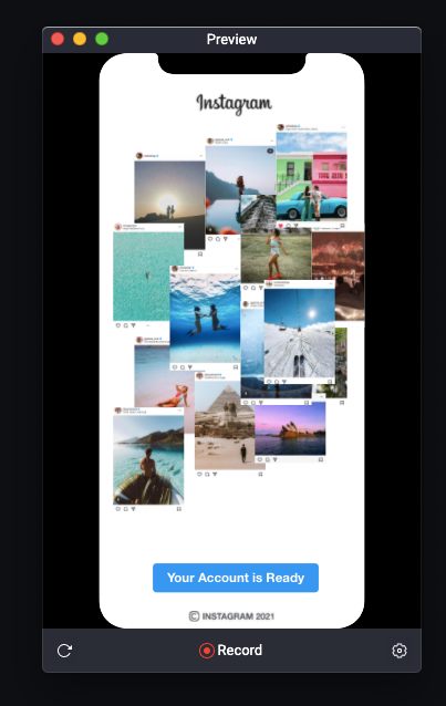
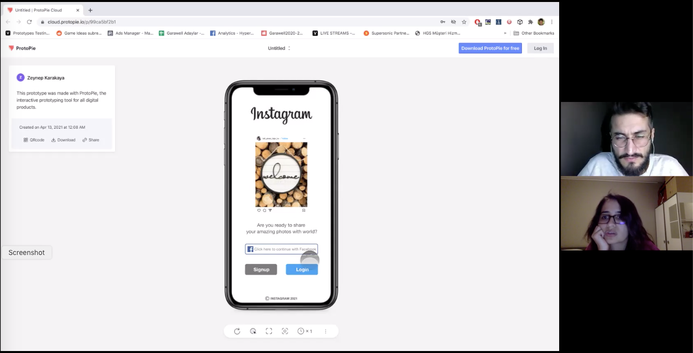
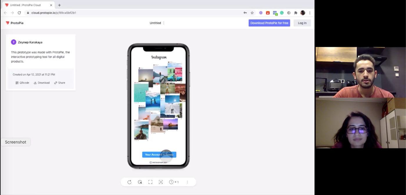
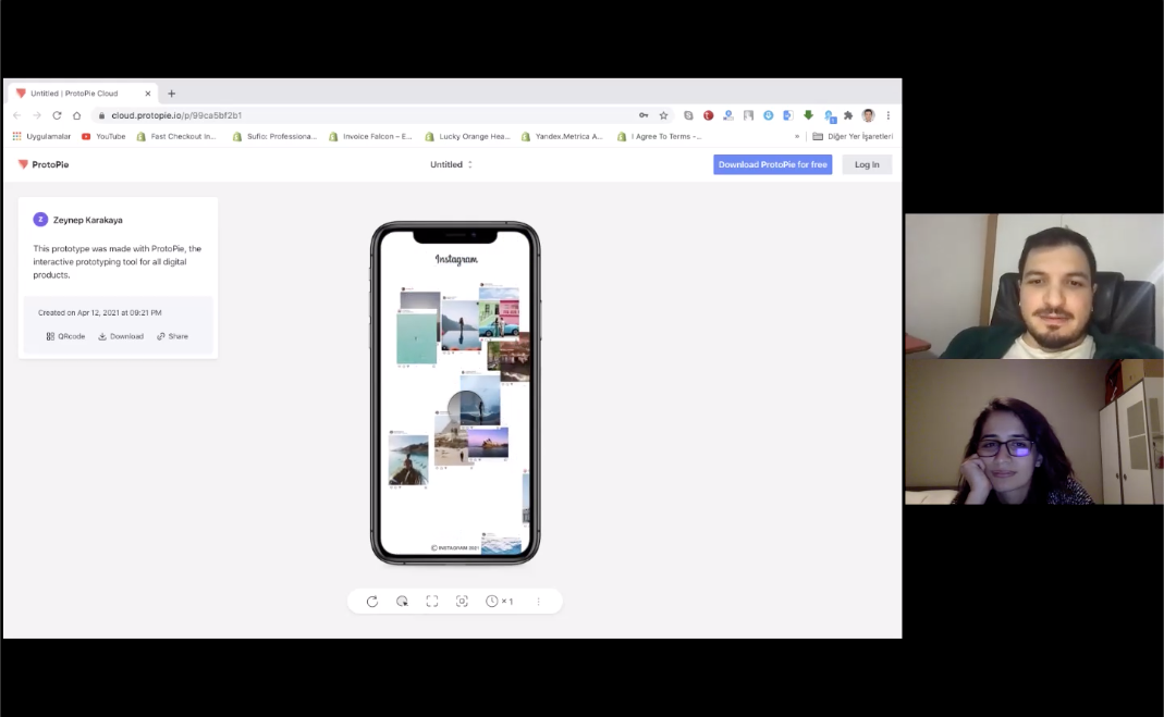
Since Instagram is a photo-based social media tool, I decided to design a photo-based signup process. Accordingly, on each screen I decided to have a nice photo from Instagram influencers and on waiting screen a photo collage to have a quick glimpse of the experience of Instagram. For photos on screens I did not add too much animations in order to have a smooth process. For the animation on waiting screen, I decided to have it 10 seconds not to be too boring. The user sees flying Instagram photos around the screen coming up to build a collage.
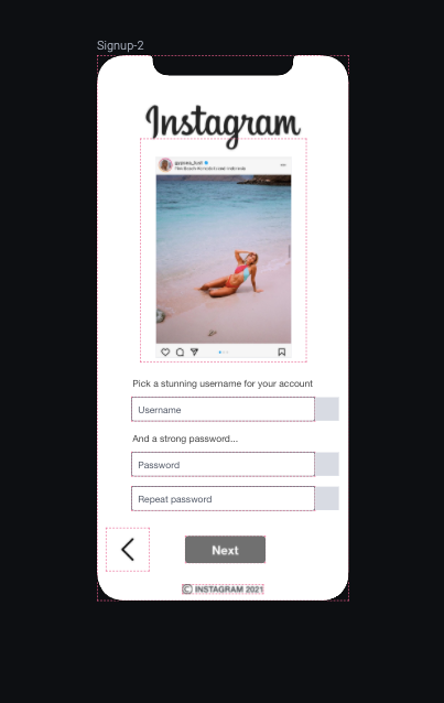
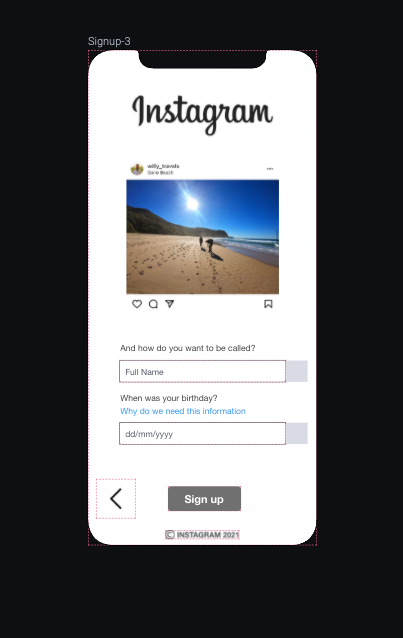
Regarding the functionality, I basically followed my design on second version of wireframes for the credentials part. When I started building the screens, I found out that the application requires lots of micro interactions, for instance automatic screen scroll when the user clicks on an input field. Otherwise user wouldn't be able to see what he/she typed, or making buttons active once credentials are filled correctly. In order to show user that he/she filled the credentials correctly, I added a tick animation next to each input field which will be visible only when user focuses out from that field he/she will see that system has accepted his/her input. As similar interaction, I made Next button clickable only after required fields are filled, or timer starts after Send Code button is clicked.
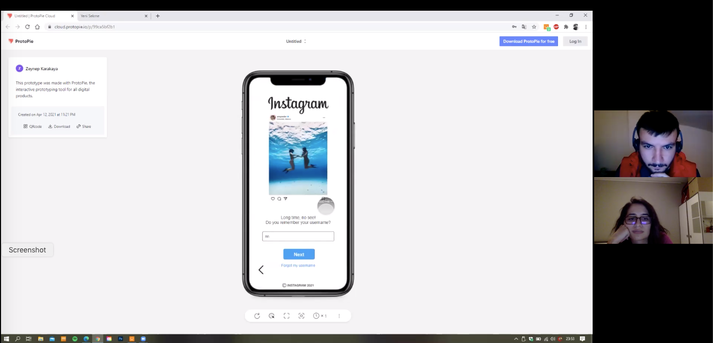
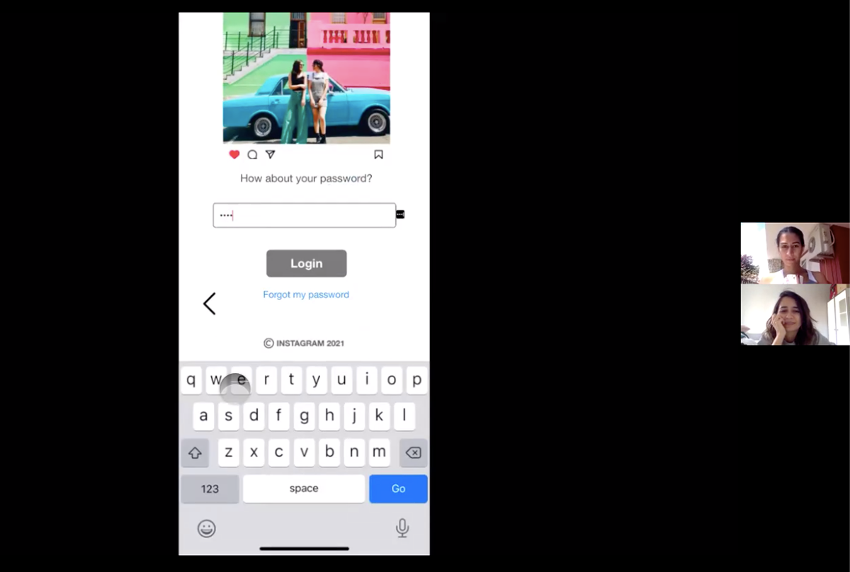
Login Process
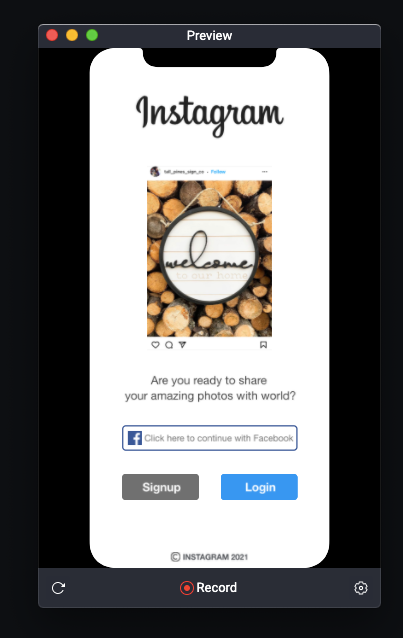
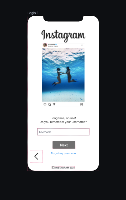
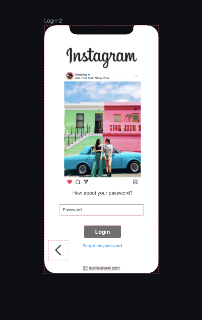
For the login process, I decided not to have a waiting screen or animations, as existing users wouldn't want to spend time with animations or long login processes. Accordingly, kept it simple with 2 nice photos on each screen. As I decided to ask username and password in different screens on my second version of wireframes, I proceed with this decision and adding "Forgot" option to each page. This way, the users will be able to locate which of the credentials they enter incorrect, so that they can access their accounts without any hassle.
You can try out the prototype from the button below (left), or you can just watch the screen recording below (right) of it to see how it is.
TESTING
As it requested on the assignment brief, I conducted usability testing with 6 people outside of our class. Again, due to Covid restrictions I planned a test setup for remote testing. I conducted the tests through Zoom and recorded them for further references. For the tests, I decided to follow the test plan that I followed for wireframe testing. Different than the last time, I could be able to share test link with the users, so I asked them to share their screen during the test. Since they interacted with the interface, it gave more real feeling to the users and allowed me to observe better. Before starting to the test, I asked them to proceed with the signing up process of the application. When they completed signing up, I asked them to login with the credentials they used. Then asked for their opinions what they liked, what bothered them, etc.
RESULTS OF TESTS
Below I analyzed the feedback I have received from the tests with my reflection on it, and if I had time how can I improve my prototype.
Email/Phone Number: I noticed that 6/6 of the users entered their emails (or faked an email), none of them entered or faked a phone number. 2 of the users tend to check their emails after they clicked on Send Code button, I needed to inform that there is no system behind the design, so there is no code in their inboxes. From this, I can tell that the prototype gave a real feeling to the users as they thought there is a real code sent to their mailboxes.
Security Code: One of the users commented that 60 seconds for code is shorter than expected. Other than that requesting a code and entering the code parts were completed by the users without any hassle.
Password: Users would like to have hide/show password option. 2/6 of the users commented that they would like to see password security requirement instructions and checks. I realized that I forgot to put password directions on the prototype after the users' feedback. So if I would improve the prototype I would work on password fields and add more instructions and hide/show options. The reason I did not add hide/show option was having 2 password fields. However, since I also forgot to add password check (system check if two password field input is the same, or not), some users got confused. So I would learn how to add that system check and hide/show password on ProtoPie for my future work.
Full Name: After choosing a username on previous screen, some users questioned Full Name field and did not want to fill in or thought it is same with the username. So I would change Full Name placeholder text to Name and Surname to eliminate the confusion.
Date of Birth: 5/6 users confused with date of birth field for different reasons. 2 of them questioned why this data is required. I responded their questions it is required by Instagram mainly to distinguish children and show sensitive content accordingly. Other than this comment, date of birth field was confusing for the users because of the input interaction. I couldn't find a way to make it smoother. So my placeholder text is "dd/mm/yyyy" and when they click on the field they see " / / ". However, the pointer does not go to the left so they needed to move it to the left manually, or delete the slashes then enter. After observing frustrations from the first 3 tests, I got rid of " / / " part, so the rest of the users entered slashes manually directly, but they also commented on birthdate section. As they are all got used to selecting date from a small calendar or dropdown menu, they did not want to write and add slashes manually. If I had more time, I would do more search to apply one of these options for selecting the date of birth.
Waiting Screen: More than half of the users liked the animations on the waiting screen and commented on them. Only two of them said that they are indifferent with animations in signup process, and they would be more happy if the process is faster. Being said that, they added it is not this prototype's animations, it is their general characteristic on getting things done as quickly as possible. 2 of the users mentioned that they wouldn't want to click on a button after the animation. They would prefer to proceed to the account automatically without a button. However, I wouldn't get rid of the button as I intentionally put a button there, so that the users will be active and decide to enter their accounts. Otherwise, they will be passive and even did not notice the collage as it would play automatically just for 10 seconds.Accordingly, I wouldn't eliminate the button, but I would convert it to a progress bar. Then users will see how long it takes and once bar is filled, it will convert to a button. Which will add a nice micro-interaction to the process I designed.
REFLECTION ON HI-FI PROTOTYPE
After analyzing the test results, I would like to do some changes on my hi-fi prototype. The first thing I would like to change is birth date input. I would like to add a drop down menu for day, month, and year but also give user the option to type. The reason I did not selected calendar is it is a mobile interface and small calendars might be difficult to use on mobile phones. Then, I would make password section more clear and efficient through adding hide/show option and also cross-check function with the instructions and requirements of the passwords. I would add Name and Surname fields to eliminate confusion on "Full Name" input field. Last but not least, I would add a filling progress bar on 10 second animation screen to make it more clear to the users.
REFLECTION ON HI-FI PROTOTYPING & TESTING
As mentioned above, I decided to proceed with ProtoPie for my hi-fi prototype. Learning a tool in a day and building a prototype on it in two days were challenging but felt good in the end. When I first started using it, I felt it is a bit difficult to design interfaces on ProtoPie directly, and I found out that we can import our design files from XD or Figma to ProtoPie to animate them. So, I decided to move to XD to have an interface design of first pages. Then, I imported my files to ProtoPie and started to learn how to make micro-interactions and animations on it. After I figured out that when I imported files to ProtoPie, the elements are not functioning well (for instance I couldn't change border color of a rectangle, I needed to imitate the same rectangle shape and deleted the imported one). Then, I decided to continue with ProtoPie for screen building as well. Only if there is something I couldn't do on ProtoPie, I moved to XD and imported individual visual. ProtoPie had a learning curve, so my first 2 screens took more time than the rest but once I feel comfortable with the features, I enjoyed using ProtoPie. All in all, ProtoPie is so powerful tool for micro-interactions and some animations. Easy to learn and use. It gives the real feeling of the product. Takes some time to build, so it is better to know what to do beforehand. Trial and error takes more time with hi-fi prototyping. After this course, I am sure I will use ProtoPie when I need to build high fidelity prototypes.
During testing, I noticed small bugs that my users did not notice. I quickly fixed them in between tests. Moreover, I realized that on the first 3 tests I got different feedbacks. However, after those 3 I did not get very different feedback or noticed something new on user interaction. Before conducting these tests, I always thought like testing a product with only 5-6 users shouldn't be enough. However, with this assignment I noticed that sometimes even 3 tests are more than enough. Another point regarding usability testing is I noticed that each person is different on thinking process. So each of us has different preferences on using digital products, and we give feedback accordingly. As a result, if we try to do test with more people, we wouldn't be able to design the product because each person might say something contradicting to the previous user. All in all, with this assignment I saw that 5-6 usability test is good for pointing out the main pain points. More than that would be confusing for the design team.